 Rolling five year returns of SPX and crude
The one month crude future has gained more than 50% year to date while SPX has gained a paltry 4.1% YTD which shows that inflation is leading the market recovery. Today’s chart looks at 5 year rolling returns of crude and SPX since 1950 As indicated in the chart SPX gained strongly in 50s and 1980-2000 and during these two periods the crude was restrained primarily due to discoveries of large oil deposits. But with specter of peak oil hovering restraining crude price might turn out to be a humongous task. And as history shows an unrestrained crude doesn’t augur well for the equity market
 SX5E vs. Average 3M Skew
 ¨ Today’s chart looks at the performance of SX5E Index for last 12 months and average 3M skew for a price band of 275. When the SX5E Index was trading at 4200+ levels the skew averaged around 9.0 vols which shows that investors were bullish despite high price levels. The skew has been building from 9.0 vols to 22 vols as the market crashed from 4200+ levels to 2275 levels. This buildup of skew has been more from hindsight rather than in anticipation, hence current high skew may be due to risk averseness among investors rather than for fundamental reasons. ¨ V2X, a measure of sentiment, currently at 66.4 vols has come off from the high of 87.5 vols. Since then the tops and bottoms of the volatile V2X has been trending down which shows that the sentiment is showing some kind of improvement. With the sentiment showing signs of stabilizing, the buildup of skew may unwind in coming days.
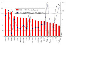 Skews vs. Open Interest (OI) Put Call ratios
 ¨ Today’s chart looks at 3 month (+/- 1SD) skews of leading indices and sectoral indices in Europe vs. the current Open Interest (OI) put call ratios. While skew can be used as a proxy for ascertaining the price the investors are paying as insurance premium against declining market the open interest put call ratio can be considered as a proxy in volume terms. ¨ Though the skew (price) of Banks is higher it is not supported by high OI put call (quantity) ratio as seen in Insurance which implies that the skew of the former has a higher chance of contracting compared to latter’s in the coming days. In similar vein, since skews of Food & Beverages, Utilities and Chemicals are relatively lower compared to the current OI put call ratio the chances of skews of these sectors scaling higher levels are more.
 SPX – Skew vs. OI Put Call ratio across maturities
 Skew and Open Interest (OI) Put Call Ratio (PCR) broadly indicate the level of short positions existing in the system, the former from volatility perspective and latter from open positions’. Skew can be considered as the price paid for the insurance against downside and PCR in quantity hence the Skew to PCR ratio is akin to insurance premium per unit of protection.We see that skews of May and June are high which resulted in lower PCR as high premium deterred market participants from taking positions in puts. As seen in the second chart the Skew to PCR ratio declines to lowest for August expiry hence skew trades (like risk reversal) on options expiring in this month can be put to work.
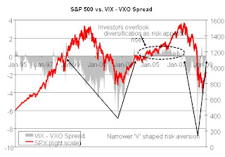 S&P 500 vs. VIX – VXO Spread
 Today’s chart looks at SPX Index since January 1995 overlaid with the spread between VIX and VXO. VXO is a volatility index for S&P 100 index and benefits less from diversification compared to VIX which is for S&P 500. Due to diversification effect VIX would normally trade lower than VXO that is S&P 500 is less risky than S&P 100. And it can be said that diversification by investors depends on the level of risk averseness among investors hence as risk appetite increases the VIX – VXO spread will narrow and may exceed zero too The chart shows that during risk aversion the spread drops considerably and with high rising risk appetite VIX exceeds VXO (2005-07). Over the last five trading sessions VIX exceeded that of VXO which shows risk appetite of investors are on rise which is good for the market. But despite the current crisis being termed as one of the worst recession since the Depression the retracement of risk aversion is narrower compared to the ‘V’ of Tech bubble crisis
 Sectoral Volatility Premium
 ¨ Today’s chart looks at sectoral volatility premium in EU and US. Sectoral volatility premium is calculated as the difference between implied volatilities of the sector index and the broader index for instance difference between implied of Financials (SXFP index) and SXXP Index. ¨ The sectoral IVOL premium for Financials in US is double that of EU Financials which is not surprising given the fact that European Financial companies have raised capital of EUR 233bn against writedowns & credit losses of EUR 216bn while US financial companies are still in deficit of EUR 92bn. Surprisingly the sectoral volatility premium of Materials based in EU is almost 3.5x that of Materials in US. despite the fact that most of the Materials companies in EU are large and oligarch. Hence shorting implied of EU based Materials might yield positive returns.
 SX5E historical risk attribution
 ¨ In an index every member contributes certain amount of risk to the index / portfolio which is proportional to the weights of the individual stock in the index, correlation between the stock and the index and finally, the volatility of the stock itself. The risk contributed by a stock to a portfolio / an index is the product of the above mentioned factors. Cumulative risk contributions by the all the members of the index would be normally lower depending on the correlations. ¨ Currently, the cumulative risk contributions by the members is lower at around 25 vols though it is twice of those levels that existed prior to September 2008 which means that risk has increased at micro level too. The spread between the index volatility and cumulative risk contribution widened during the Q4 of 2008 as the systematic risk rose. This spread is on the decline hinting that the correlation risk is on wane.
 Impact of subprime on CDX NA IG and XO (dated 11 Dec 07)
 ¨ Today’s chart is a scatter plot between CDX NA IG and XO spreads. The plot shows that IG was less sensitive to changes in XO prior to the subprime but post subprime the IG has become more elastic to XO which shows that IG firms are riskier than XO, which contains lower rated firms. Once the crisis allays IG firms would start outperforming XO firms
 PE ratio & corporate profit fluctuations
 ¨ Today’s chart looks at the impact of fluctuating corporate profit (CPBITCQQ Index) on PE ratio (SPX Index). Investors demand extra premium when earnings are more volatile leading to decline in PE. The chart shows that in 91-92 when earnings growth was stable PE increased, so was the case in 95-98. In 93-94 and since ’03 when earnings became volatile the PE dropped. With recent write downs further drop in PE is expected.
 SX5E’s Open Interest (OI) weighted strikes vs. spot
 ¨ Today’s chart looks at SX5E since April 01, 2009 overlaid with Open Interest (OI) weighted strikes of June expiry puts and calls. OI on standalone basis doesn’t yield much information about underlying views of the market players and hence segregating open positions based on the type of option (call / put) might provide some perspectives of bulls and bears in the market ¨ The chart shows that since April 01 the index has rallied from 2100 to 2432 and despite the strong rally we see that the OI weighted strikes of both calls and puts have remained sticky. The put OI weighted strike is up by 15 points from April 01, while that of call is up by 26 points which broadly indicates rise in optimism yet these have still fallen back considerably as against the spot. This shows that some correction may be in offing in coming days
 SX5E’s Open Interest Put Call Ratios
 ¨ With May expiry closing in today’s chart looks at SX5E’s Open Interest (OI) Put Call Ratio (PCR) across strikes ranging from 2000 to 3000 at a strike interval of 100 points, currently SX5E spot is at 2433. Due to the unprecedented recovery rally the short positions for strikes from 2000 to 2300 which accounts for 77% of total put open positions for the strikes taken into account might end worthless or get rolled over on May 15th (the chance of the index dropping below 2200 is less than 1/5) on the contrary percentage of calls that might end up unexercised is 1% with 70% plus chance
¨ We see from the chart that the market is mostly positive for strikes above 2300 as PCR is less than 1 except for the kinks at 2400 strike for December expiry and at 2900 for June expiry. Based on the current at the money implied volatility of June contracts the chance that the index rises above 2900 is less than 33% hence seller of 2900 June puts might lose out

 Implied volatilities vs. Skews
 ¨ Today’s chart looks at SX5E’s 3 month implied volatilities, and skews from both 90-110 moneyness and -/+ 1 standard deviations over last two years. We see that the implied volatility and skew based on standard deviation move in locked foot steps while this kind of strong relationship is not seen between implied volatility and skew based on moneyness. The second chart with scatter plots of implied volatility vs. moneyness skew and implied volatility vs. standard deviation skew further substantiates the argument as the former has a R2 of 11.2% compared to a very high R2 of 87.9% for the latter
¨ The reason for the difference is that the moneyness skew doesn’t capture volatility of the market while standard deviation skew does. During high volatility regimes skew remains relatively flatter near the spot as traders are interested in deep in the money and deep out of the money options. Hence despite high vol regimes moneyness skew doesn’t bid up much and hence doesn’t capture the extent of short positions in the market. Though standard deviation skew is a better indicator of premium paid for downside it has a disadvantage, the tedious process of back calculating the strikes while for moneyness it is easier
 3M implieds and skews of leading indices
¨ Today’s chart looks at implieds and skews (+/-1 SD) of options expiring in 3 months of SPX, DAX, UKX, SX5E, CAC and SMI. The implieds of the indices have declined by more than 16 vols since October 16th when V2X clocked its historical high of 87.5 vols; volatilities of SX5E and CAC have crashed down the most by more than 21 vols. Skews too have declined with SPX leading, a decline of 3.6 vols followed by SX5E’s 2.9 vols.
¨ Normally, a positive relationship is seen between the implied and skew, high implied is accompanied by high skew and low implied by low skew. But as the chart indicates the skews of SX5E and CAC are at high levels of 20+ vols while the implieds are at sub 44 levels. Despite the compression of the skews of SX5E and CAC, the steep skews shows that some profitable spread trades are possible on SX5E and CAC.

 Implied correlations termstructure
¨ SX5E Index has gained more than 24% from its low of 1809 as on 9th March while V2X has lost more than 10 vols over the period. Hence to get the market’s perspective on the systematic risk today’s chart looks at implied correlations of leading indices across maturities. The calculated implied correlation is a proxy which is the ratio of the index implied volatility and market cap weighted single stock volatility of the respective tenor
¨ The chart shows that the correlation termstructures are upward sloping (like forward sloping termstructures in other assets like government bond, CDS and volatility) hint the return of positive sentiment to the market. Compared to correlation termstructures as on February 17th have steepened considerably but at the same time these have moved in, for instance the correlations of 1 month on February 17th were well above 70% while currently these are below 70%. With the market turning bullish, exposure to pro-cyclical industries like Consumer Discretionary, Materials and Energy might be rewarding. Based on this premise DAX’s correlation termstructure seems to be flat despite its strong exposure to Consumer Discretionary (13.8%) and Materials (11.3%) apart from 18.5% exposure to Financials and hence a dispersion trade on DAX might pay off. On the other extreme SX5E’s high correlation is due to its lopsided exposure of 22.4% to Financials and once this sector runs out of steam the correlation termstructure might flatten and move in


