Thursday, November 19, 2009

Gold, a bubble?


Yesterday, gold closed at USD 1145, the historical high, and the metal over last 12 months has generated a return of more than 50%, outperforming the broader equity market by more than 18%. The following charts look at relationship between gold price and an index that is proxy for gold price, and also evolutions of these two.

Gold is an asset which is primarily used as a hedge against inflation and also as a hedge against crisis i.e. investors seek gold when the risk averseness increases. On the other hand gold is an anathema during strong growth period. Hence price of gold theoretically should be proportional to risk averseness and inflation, and inversely related to growth. Based on this premise an index as proxy for gold price was devised as follows,
Gold Proxy Ratio Index = (1 + rp) * (1+ Πe) / (1 + ge)
where,

rp - risk premium (difference between SPX’s earning yield and 5 year US Treasury yield)

Πe - expected inflation (breakeven from 5 year Treasury Inflation Protected Securities, TIPS)

ge - expected growth (yield of 5 year TIPS)

The scatter plot shows that since August the relationship has deviated from the normal course in favour of gold price hinting that the recent run up seen in gold might be a bubble in formative stage. The line chart too shows a considerable divergence between gold price and the proxy.

Friday, October 16, 2009

Thenkulam Index

From technical perspective market is said to be strong if demand for stocks rises despite increase in stock price and volume declines as the price slides. The following chart shows the relationship between stock price and volume traded in a strong market


In a weak market the relationship gets reversed, volume increases as price declines and vice versa. The following chart shows relationship between price and volume traded in a weak market


Based on these premises a new technical analysis too is developed to gauge the strength of the market which is ratio of % change in price and % change in volume. In strong market the ratio will be positive and negative otherwise


Fine tuning the tool further the Thenkalam Index looks at relative strength temporally; the derivation is as follows
· X = 1 if the ratio is positive (i.e. the market is strong) and 0 if the ratio is negative
· Thenkalam Index = 20 day MA of X – 40 day MA of X

If the index indicates that the market is stronger when the index rises above zero and weaker when the index is below zero (refer to the chart given above)

The following chart shows the difference between 5 day moving average and 10 day moving average. We can see that the market broadly rallies after a spike in the index

Thursday, October 8, 2009

Crude's supposedly demand curves


Despite the significance the chart is flawed since demand curve factors price and quantity, and not time.
I am trying to integrate time into demand and supply curve which will most probably result in cyclical pattern from a '8' shaped loop. The second chart is just part of this step


Tuesday, October 6, 2009

U to W by Keynes


Keynes & shapes of recession
Just few months ago the world was swamped with images of the Great Depression. Thanks to media, each and every one who had access to 24X7 TV networks knew what a recession (if not depression) as financial analyst / economist took extra effort to showcase there awareness on the Great Depression and recession. The resurgent market and reviving economy has taken everyone by surprise and it seems that Keynes has rescued the global economy once again from depression; 70s saw ‘W’ shaped recovery which possibly could have been another painful ‘U’ shaped recession. The chart shows US's Federal deficit overlaid with shaded areas for NBER's recession. It seems that Keynes apart from changing 'U' to 'W' (shape of recovery) has also lowered the frequency of recessions.

Friday, September 18, 2009


Implied vs. Realized Correlations
Today’s chart looks at the 3 month implied and realized correlations of some of the leading ETFs. Correlation is calculated as a ratio of the index implied volatility and market cap weighted implied volatility
Implied correlations of all ETFs’ are greater than 3 month realized correlation the exception being RKH. Implied correlations of pro-cyclical sectors like XLE and XLI are 87% and 88% and with decline of economy decelerating these sectors can be expected to perform well in coming days. Implied correlation of RKH is lower than realized as some divergence is performances by the members of the ETF is expected

S&P 500 vs. Expected Inflation
This chart looks at the SPX and 10 year inflation expectations since August 1998. The market seems to be finally hitting a patch; VIX yesterday rose again above 30 vols level and SPX has been losing momentum
As shown in the chart the rally seems to be driven by inflation. The 10 year breakeven rate which dropped below zero on November 20th due to deflation concern has surged to 1.7%. The surge in inflation expectation was followed by the current rally which is primarily due to pump-priming by the central banks

S&P 500 one year rolling returns and recession
§ Today’s chart looks at the rolling one year returns of S&P 500 since 1948 juxtaposed against periods of recession. Many analysts are of the view that current ongoing recession would most probably turn out to be a “U” shaped rather than the preferred “V” shaped. It is also expected that the current crisis would be worse than the oil crisis infected recessions of 70s but better than the Depression. If the predictions of these analysts turn true then the market will remain in negative territory for many months to come.
§ Despite the bleak picture the chart shows that most of the market recovery starts while the recession is underway. As shown in the chart the market has slid the most since 1948 and tad worse than 1970s hence some more correction might be in store. Notwithstanding the downside risks investing in recession yields good payoffs.

Monday, September 14, 2009

Daily bread

Rolling five year returns of SPX and crude
The one month crude future has gained more than 50% year to date while SPX has gained a paltry 4.1% YTD which shows that inflation is leading the market recovery. Today’s chart looks at 5 year rolling returns of crude and SPX since 1950 As indicated in the chart SPX gained strongly in 50s and 1980-2000 and during these two periods the crude was restrained primarily due to discoveries of large oil deposits. But with specter of peak oil hovering restraining crude price might turn out to be a humongous task. And as history shows an unrestrained crude doesn’t augur well for the equity market

SX5E vs. Average 3M Skew
¨ Today’s chart looks at the performance of SX5E Index for last 12 months and average 3M skew for a price band of 275. When the SX5E Index was trading at 4200+ levels the skew averaged around 9.0 vols which shows that investors were bullish despite high price levels. The skew has been building from 9.0 vols to 22 vols as the market crashed from 4200+ levels to 2275 levels. This buildup of skew has been more from hindsight rather than in anticipation, hence current high skew may be due to risk averseness among investors rather than for fundamental reasons. ¨ V2X, a measure of sentiment, currently at 66.4 vols has come off from the high of 87.5 vols. Since then the tops and bottoms of the volatile V2X has been trending down which shows that the sentiment is showing some kind of improvement. With the sentiment showing signs of stabilizing, the buildup of skew may unwind in coming days.

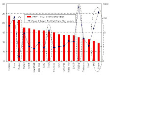
Skews vs. Open Interest (OI) Put Call ratios
¨ Today’s chart looks at 3 month (+/- 1SD) skews of leading indices and sectoral indices in Europe vs. the current Open Interest (OI) put call ratios. While skew can be used as a proxy for ascertaining the price the investors are paying as insurance premium against declining market the open interest put call ratio can be considered as a proxy in volume terms. ¨ Though the skew (price) of Banks is higher it is not supported by high OI put call (quantity) ratio as seen in Insurance which implies that the skew of the former has a higher chance of contracting compared to latter’s in the coming days. In similar vein, since skews of Food & Beverages, Utilities and Chemicals are relatively lower compared to the current OI put call ratio the chances of skews of these sectors scaling higher levels are more.
SPX – Skew vs. OI Put Call ratio across maturities
Skew and Open Interest (OI) Put Call Ratio (PCR) broadly indicate the level of short positions existing in the system, the former from volatility perspective and latter from open positions’. Skew can be considered as the price paid for the insurance against downside and PCR in quantity hence the Skew to PCR ratio is akin to insurance premium per unit of protection.We see that skews of May and June are high which resulted in lower PCR as high premium deterred market participants from taking positions in puts. As seen in the second chart the Skew to PCR ratio declines to lowest for August expiry hence skew trades (like risk reversal) on options expiring in this month can be put to work.


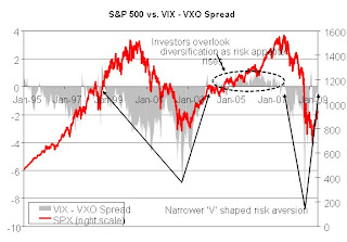
S&P 500 vs. VIX – VXO Spread
Today’s chart looks at SPX Index since January 1995 overlaid with the spread between VIX and VXO. VXO is a volatility index for S&P 100 index and benefits less from diversification compared to VIX which is for S&P 500. Due to diversification effect VIX would normally trade lower than VXO that is S&P 500 is less risky than S&P 100. And it can be said that diversification by investors depends on the level of risk averseness among investors hence as risk appetite increases the VIX – VXO spread will narrow and may exceed zero too The chart shows that during risk aversion the spread drops considerably and with high rising risk appetite VIX exceeds VXO (2005-07). Over the last five trading sessions VIX exceeded that of VXO which shows risk appetite of investors are on rise which is good for the market. But despite the current crisis being termed as one of the worst recession since the Depression the retracement of risk aversion is narrower compared to the ‘V’ of Tech bubble crisis
Sectoral Volatility Premium
¨ Today’s chart looks at sectoral volatility premium in EU and US. Sectoral volatility premium is calculated as the difference between implied volatilities of the sector index and the broader index for instance difference between implied of Financials (SXFP index) and SXXP Index. ¨ The sectoral IVOL premium for Financials in US is double that of EU Financials which is not surprising given the fact that European Financial companies have raised capital of EUR 233bn against writedowns & credit losses of EUR 216bn while US financial companies are still in deficit of EUR 92bn. Surprisingly the sectoral volatility premium of Materials based in EU is almost 3.5x that of Materials in US. despite the fact that most of the Materials companies in EU are large and oligarch. Hence shorting implied of EU based Materials might yield positive returns.


SX5E historical risk attribution
¨ In an index every member contributes certain amount of risk to the index / portfolio which is proportional to the weights of the individual stock in the index, correlation between the stock and the index and finally, the volatility of the stock itself. The risk contributed by a stock to a portfolio / an index is the product of the above mentioned factors. Cumulative risk contributions by the all the members of the index would be normally lower depending on the correlations. ¨ Currently, the cumulative risk contributions by the members is lower at around 25 vols though it is twice of those levels that existed prior to September 2008 which means that risk has increased at micro level too. The spread between the index volatility and cumulative risk contribution widened during the Q4 of 2008 as the systematic risk rose. This spread is on the decline hinting that the correlation risk is on wane.

Impact of subprime on CDX NA IG and XO (dated 11 Dec 07)
¨ Today’s chart is a scatter plot between CDX NA IG and XO spreads. The plot shows that IG was less sensitive to changes in XO prior to the subprime but post subprime the IG has become more elastic to XO which shows that IG firms are riskier than XO, which contains lower rated firms. Once the crisis allays IG firms would start outperforming XO firms

PE ratio & corporate profit fluctuations
¨ Today’s chart looks at the impact of fluctuating corporate profit (CPBITCQQ Index) on PE ratio (SPX Index). Investors demand extra premium when earnings are more volatile leading to decline in PE. The chart shows that in 91-92 when earnings growth was stable PE increased, so was the case in 95-98. In 93-94 and since ’03 when earnings became volatile the PE dropped. With recent write downs further drop in PE is expected.
SX5E’s Open Interest (OI) weighted strikes vs. spot
¨ Today’s chart looks at SX5E since April 01, 2009 overlaid with Open Interest (OI) weighted strikes of June expiry puts and calls. OI on standalone basis doesn’t yield much information about underlying views of the market players and hence segregating open positions based on the type of option (call / put) might provide some perspectives of bulls and bears in the market ¨ The chart shows that since April 01 the index has rallied from 2100 to 2432 and despite the strong rally we see that the OI weighted strikes of both calls and puts have remained sticky. The put OI weighted strike is up by 15 points from April 01, while that of call is up by 26 points which broadly indicates rise in optimism yet these have still fallen back considerably as against the spot. This shows that some correction may be in offing in coming days
SX5E’s Open Interest Put Call Ratios
¨ With May expiry closing in today’s chart looks at SX5E’s Open Interest (OI) Put Call Ratio (PCR) across strikes ranging from 2000 to 3000 at a strike interval of 100 points, currently SX5E spot is at 2433. Due to the unprecedented recovery rally the short positions for strikes from 2000 to 2300 which accounts for 77% of total put open positions for the strikes taken into account might end worthless or get rolled over on May 15th (the chance of the index dropping below 2200 is less than 1/5) on the contrary percentage of calls that might end up unexercised is 1% with 70% plus chance
¨ We see from the chart that the market is mostly positive for strikes above 2300 as PCR is less than 1 except for the kinks at 2400 strike for December expiry and at 2900 for June expiry. Based on the current at the money implied volatility of June contracts the chance that the index rises above 2900 is less than 33% hence seller of 2900 June puts might lose out
Implied volatilities vs. Skews
¨ Today’s chart looks at SX5E’s 3 month implied volatilities, and skews from both 90-110 moneyness and -/+ 1 standard deviations over last two years. We see that the implied volatility and skew based on standard deviation move in locked foot steps while this kind of strong relationship is not seen between implied volatility and skew based on moneyness. The second chart with scatter plots of implied volatility vs. moneyness skew and implied volatility vs. standard deviation skew further substantiates the argument as the former has a R2 of 11.2% compared to a very high R2 of 87.9% for the latter
¨ The reason for the difference is that the moneyness skew doesn’t capture volatility of the market while standard deviation skew does. During high volatility regimes skew remains relatively flatter near the spot as traders are interested in deep in the money and deep out of the money options. Hence despite high vol regimes moneyness skew doesn’t bid up much and hence doesn’t capture the extent of short positions in the market. Though standard deviation skew is a better indicator of premium paid for downside it has a disadvantage, the tedious process of back calculating the strikes while for moneyness it is easier
3M implieds and skews of leading indices
¨ Today’s chart looks at implieds and skews (+/-1 SD) of options expiring in 3 months of SPX, DAX, UKX, SX5E, CAC and SMI. The implieds of the indices have declined by more than 16 vols since October 16th when V2X clocked its historical high of 87.5 vols; volatilities of SX5E and CAC have crashed down the most by more than 21 vols. Skews too have declined with SPX leading, a decline of 3.6 vols followed by SX5E’s 2.9 vols.
¨ Normally, a positive relationship is seen between the implied and skew, high implied is accompanied by high skew and low implied by low skew. But as the chart indicates the skews of SX5E and CAC are at high levels of 20+ vols while the implieds are at sub 44 levels. Despite the compression of the skews of SX5E and CAC, the steep skews shows that some profitable spread trades are possible on SX5E and CAC.
Implied correlations termstructure
¨ SX5E Index has gained more than 24% from its low of 1809 as on 9th March while V2X has lost more than 10 vols over the period. Hence to get the market’s perspective on the systematic risk today’s chart looks at implied correlations of leading indices across maturities. The calculated implied correlation is a proxy which is the ratio of the index implied volatility and market cap weighted single stock volatility of the respective tenor
¨ The chart shows that the correlation termstructures are upward sloping (like forward sloping termstructures in other assets like government bond, CDS and volatility) hint the return of positive sentiment to the market. Compared to correlation termstructures as on February 17th have steepened considerably but at the same time these have moved in, for instance the correlations of 1 month on February 17th were well above 70% while currently these are below 70%. With the market turning bullish, exposure to pro-cyclical industries like Consumer Discretionary, Materials and Energy might be rewarding. Based on this premise DAX’s correlation termstructure seems to be flat despite its strong exposure to Consumer Discretionary (13.8%) and Materials (11.3%) apart from 18.5% exposure to Financials and hence a dispersion trade on DAX might pay off. On the other extreme SX5E’s high correlation is due to its lopsided exposure of 22.4% to Financials and once this sector runs out of steam the correlation termstructure might flatten and move in


Relationship between stock and CDS
¨ Today’s chart looks at how the relationship between the stock and CDS changes as credit risk increases. (Stock prices and CDS spreads are indexed) ¨ The relationship between stock and CDS is inverted and stock price becomes more elastic to change in spread as credit risk increases ¨ There are three clusters 1. GM & F (stock price very elastic due to junk status) 2. GS (less elastic as it is not a victim of subprime) 3. ML, LEH and BSC (market has slotted LEH with other subprime victims though it is yet to announce any subprime related write offs)

Saturday, September 12, 2009

Credit Suisse Fear Barometer (CSFB) index

Credit Suisse (CS) recently launched a fear index (CSFB Index) which the firm expects to replace the most prominent ‘fear’ index VIX. The idea behind the CSFB Index is to quantify fear by ‘zero premium’ collar on the underlying asset. This combination trade consists of selling a call option at strike 10% above the spot by receiving Rs. X as premium and buying a put of strike Y% lower than the spot by paying a premium of Rs. X, thereby the initial net outlay is zero. The owner of the combo trade is ready to sacrifice more than 10% gain in return cuts the loss to the maximum of Y%. The CSFB’ fear index is nothing but this ‘Y’. The report’s contention is that more the Y%, the lesser is the protection one is getting hence this is an indicator of fear. Based on following two counter points the CS fear index pales against VIX as a measure of fear
1. For the above italicized assumption the counter could be that when Y% > 10% the trader won’t put in a collar trade unless he is bullish since he would be betting 10% upside against Y% downside. We see that the CSFB index peaked before the crisis as the traders were over confident or irrationally exuberant. Hence prima facie the index is not reflective of fear among investors. 2. The price of an option is a function of five factors as per Black Scholes and deciding fear just by price is flawed. The interest rate, an often ignored factor, justifiably over short period can’t be ignored when developing an index as the prices are impacted by the prevailing interest rate regime. When interest rate rises and other factors maintain status quo put price declines while call rises. We know that Call = S N(d1) – PV (Strike) N(d2) Put = PV(Strike) N(-d2) – S N(-d1) and as interest rate rises PV(Strike) declines hence price of put decreases and while that of call increases. And hence for the collar trade the trader might have to go deep Out of The Money (OTM) which increases Y% which in turn leads to rise in CSFB index. We see that though CSFB is choppy both the CSFB index and 3 month government yield trend together. The argument is that though interest rate is comparatively minor factor during high interest rate regime it certainly matters in pricing options.
Despite CS’s hullabaloo and marketing gimmicks VIX will still remain the most favoured measure of fear

Thursday, April 16, 2009

Growth vs Risk


S&P 500 vs. Real yield by VIX
¨ Theoretically to price an asset two major factors that are taken into account are expected yield and expected future growth rate. But in reality there are other factors that too impact the pricing of asset due to factors of supply and demand. Today’s chart looks at the performance of S&P 500 since 1997 overlaid with and a ratio which is the 5 year TIPS yield adjusted by VIX i.e. (1+ 5Y TIPS yield) / (1+VIX)
¨ The yield expected by investors on assets is the sum of risk free rate i.e. yield on government bond and risk premium, the latter is dependant on the risk which is volatility of an asset. Assuming yield as a proxy for expected growth and VIX as a proxy for risk premium we get the primary ingredients to price S&P 500. Though the caveat is that the maturities of government yield and VIX are not comparable. Using two factors we get a ratio which kind of replicates the price level of S&P 500

Friday, April 10, 2009

Men will be men

Check out http://hostmypics.co.za/show.php/84_beckham.jpg.html
Don't miss the last image it is worth a Mona Lisa
Once again thanks to Pranav

Open fly

Check out: http://en.wikipedia.org/wiki/Open_fly
An open fly refers to the unintentional leaving of one's fly unzipped or unbuttoned. It is often considered humorous if a person is caught with his or her fly down.

Your fly is open!
However, the situation is not always seen as embarrassing. Winston Churchill, while at a public function, was handed a note reading "your fly is unbuttoned." Churchill scrawled on the note returning it as "dead birds do not drop out of nests."[1]

Thanks to Pranav

Friday, March 27, 2009

Charts by a 'Ghost'


Chart of the Day: Volatilities and earnings
¨ Today’s chart looks at the 1 month implied volatility and 1 month forward volatility 1 month (1M X 1M forward implied) hence and compares it with the percentage of companies that will be reporting earnings in the first and second months from today. The forward volatility is interpolated from one month and two month implied volatilities.
¨ As the chart shows number of companies reporting earnings in the first month exceeds that of the second month which has led to 1 month IVOL to trade at a higher level than 1M X 1M forward IVOL in most of the cases. The 1M X 1M forward volatilities of Telecom and Technology are currently exceeding the spot one month implied volatilities, though the latter’s level can be attributed to the same number of companies reporting earnings in the second month as in the first month. The largest differences between spot 1M IVOL and 1M X 1M forward IVOL are seen in Insurance, Banks, Industrial Goods and Chemicals in declining order. Larger the difference larger is the expectation of decline in volatility one month hence by the market.


Chart of the Day: SXXP sectors’ risk and return contributions
¨ Today’s chart looks at the last 3 month return and risk contributions by 19 sectors that are part of the broader index, SXXP. The risk contribution is calculated as the product of correlation between sector index and SXXP, weights of the sector index in SXXP and 3 month realized volatility of the sector index. The return contribution is product of weights and return generated over last 3 months by the sector index.
¨ The largest contributors of the risk are Banks, Oil & Gas and Industrial Goods. Though the risk return profile of Banks are in line with the premise of high risk low return, the profiles of Oil &Gas and Industrial Goods are surprising, especially for the latter. Though Industrial Goods risk contribution is 3.39, the third highest, its return contribution has been positive. Retail industry is another industry that has outperformed from risk adjusted return perspective. Chemical industry due to its oligopoly structure has returned positive risk adjusted return.


Chart of the Day: Implied correlations across volatility termstructure
¨ Today’s chart looks at the implied correlations across the implied volatility termstructures of leading indices in Europe. Implied correlation is the ratio of the implied volatility of the index to the weighted average implied volatility of the members of the index. An upward sloping correlation termstructure indicates that in future most of the members in the index might move in tandem, while downward sloping indicates that the participants will be more discerning in picking individual stocks: i.e. going short on some and long on others.
¨ Downward sloping correlation termstructures of UKX, SX5E and DAX show that in coming days the market will try to separate the wheat from the chaff. And the upward sloping termstructure of SMI combined with low volatility indicate that the investors are still seeking recession resistant industries like heath care and consumer staples; these two industries account for 43% of SMI’s weight


Chart of the Day: Open Interest (OI) weighted strikes for Feb expiry
¨ Today’s chart looks at how far the Call and Put Open Interest (OI) weighted strikes of some leading indices is from the spot in percentage (return) terms. The chart is overlaid with the expected move of the underlying as implied by the option volatility. As the OI weighted strike moves further away as compared to the implied move, the number of options going unexercised may rise. In contrast to other indices, the SMI has several in-the-money puts
¨ The distance of OI weighted strike from the spot can also indicate the breadth of the price range expected by market participants and compare it with the implied move. For instance the OI weighted strikes of both call and put for SPX is relatively wider as against the implied move when compared to other indices.


Chart of the Day: Sectoral Volatility Premium – EU vs. US
¨ Today’s chart is a scatter plot of 3M implied volatility premium of sectoral indices in EU and US as against the broader market indices, SXXP and SPX, respectively i.e the differences between implied volatilities of sectoral indices and respective broader indices. In a globalized world the volatility premium across regions if not at par should be trading in a close range. Especially, US and EU being the two most open economies in the world with strong trade relationship should have volatility premiums at par except for anomalies caused due to some region specific issues related to sectors.
¨ Financials sector in EU is trading at lesser premium of 6.4 vols compared to 41.7 vols of the US which reflects the losses accumulated by American banks to the tune of USD 810 bn compared to USD 349bn by European banks; moreover European banks have raised capital in excess of the losses while US banks are still short of USD 239bn. Surprisingly though Materials sector in EU trading is at 27 vols premium as against 8.7 vols in US hence shorting volatility of EU material sector might pay off. Energy and Healthcare are other two sectors that show a dichotomy between volatility premiums in US and EU. EU’s healthcare is trading at a deep discount of 16.4 vols as against US’s 7.1 vols discount. Energy in US is trading at a premium of 12 vols compared to a paltry 2.6 vols in Europe.


Chart of the Day: Credit spreads – IG, XO vs. Financials
¨ Today’s chart looks at the evolution of the spread between iTraxx 5Y IG CDS and iTraxx 5Y Financials and also spread between iTraxx 5Y Crossover (XO) and iTraxx 5Y Financials. These two spreads actually look at the margins a financial company might make by lending to investment grade and lower rated companies
¨ Generally, Financial companies as an intermediary of transactions in an economy borrow at lower credit spread and lend at higher spread. Prior to subprime crisis financial companies made a margin of 15 bps and 200 bps by lending to IG and XO companies, respectively. But recently the spread between IG and Finacials have shrunk to zero levels while the margin for XO is a healthy 800+ bps, there by making lending to IG companies unprofitable and during recession lending to XO gets riskier despite tempting spread margins. Hence to spur lending by banks the balance sheet of banks and financial institutions have to be recapitalized


Chart of the Day: SX5E’s option to stock volume ratio
¨ Today’s chart looks at the evolution of the ratio of option volumes to equity volume ratio of SX5E index since January 2006. The data series were smoothened by taking 20 day averages. We have seen that as the risk averseness among investors rose the option volume too gained momentum. SX5E option volume which was around half a million rose to 2.5 million per day as volatility surged. As the volatility eased hedged positions were unwound and hence the option volume declined
¨ Since the start of this year the volume gained by equity was higher than the gain seen by the options, equity volume rose by 49% compared to option’s 33%. And as the volatility settles within a range the volume might decline further and there by the pin risk will diminish in future expiries


Chart of the Day: SX5E Open Interest (OI) rollovers
¨ Today’s chart looks at the evolutions of open interest (OI) of both call and put options of March and June expiries since March 2nd 2009. The open interest is the sum of the open positions of strikes on SX5E ranging from 1500 to 2500 at an interval of 100
¨ The chart shows that as the market rallied from 1,882 to 2,050 the put open interests got unwound while call open positions were being strengthened as indicated by converging of March expiry put and call open positions. Currently conflicting signals are emanating from the OI evolutions, while the put OIs of June expiry are consistently exceeding that of March expiry, the March call OIs exceeded that of June consistently. This indicates that the rally might just end up becoming the third bear rally since October 2008. Though the positive signal is that the June call OI has risen by 270,000 contracts since the start of March compared to 175,000 increase in June put OI


Chart of the Day: Weighted implied vs. Weighted CDS
¨ Today’s chart looks at the weighted 3M implied volatilities and weighted 5y CDS spreads of leading indices. Though there are options available on indices like SX5E, DAX and others, non availability of similar kind of credit indices with similar underlying make comparison of implied of the index and credit index unfair. Hence to over come the issues of different underlying and correlation, plain market cap weighted implied volatilities and CDS spreads are used to compare the pricing between option and credit markets
¨ The chart shows despite SX5E index’s low weighted CDS spread of 123.7bps the 3m implied volatility is almost at 50 vols, which indicates that option market is pricing is more risk premium than credit market. Similar kind of divergence is also seen in UKX and SPX. While weighted CDS spreads of SPX and UKX are 186bps and 189bps, respectively, SPX’s implied is trading at a premium of 4 vols over UKX’s


Chart of the Day: Sectoral earnings yield vs. 3M implied volatilities
¨ When pricing an asset required risk premium is an important factor. Earnings yield net of treasury yield is a measure of risk premium; for the chart 5 year treasury yield was considered. The risk premium is a function of volatility of the asset hence volatility and risk premium from earnings yield have a strong relationship. As shown in the chart the straight line is best fit line based on historical relationship between 3M implied volatility and risk premium of SX5E. We see that the relationship is linear and has a R2 of a healthy 83%.
¨ Based on this premise we can use the relationship to pick volatilities that are trading rich as against the equity risk premium. For instance Banks despite low risk premium are trading at a vol of 65. Other sectors whose volatilities are trading at premium relative to risk premium are Insurance and Industrial Goods. On the contrary Food & Beverages, Basic Resources and Oil & gas are trading lower volatilities as against equity risk premium.


Chart of the Day: Crude Contango / Backwardation vs. Expected inflation in Europe
¨ Today’s chart looks at the relationship between crude contango / backwardation vs. 5 year inflation expected in Europe by investors. Crude is said to be trading contango when the 12 month crude futures is trading above the 1 month futures and vice versa is termed as backwardation
¨ Bond, currency and to certain an extent commodity markets foretell what can be expected in equity market. For instance inversion of treasury termstructure augurs bear market. In similar vein crude trading in contango means that the inflation is expected to rise in the coming days. In the chart we can see inflation following contango / backwardation with a lag and currently despite contango the expected inflation is on the decline. Sooner or later the expected inflation will start to rear its ugly head which will make investors rotate money from bond into equity